
The Form Settings section allows you to customize how your withdrawal form looks and behaves on your storefront. You can control where the form is displayed, edit labels and text, customize its appearance, and configure the success message shown after customers submit a request.
Step 1: Open Form Settings
From the Local EU Withdrawal app, navigate to Form Settings
You'll see four customization tabs:
- General
- Content
- Style
- Confirmation
A live preview is displayed on the right side, allowing you to see changes instantly before saving.
Step 2: Configure General Settings
The General tab controls where the withdrawal form is available and how customers open it.
Country Visibility:
Choose where the withdrawal form should appear:
- Show in all countries – Display the form for every visitor.
- Hide in selected countries – Hide the form only in selected countries.
- Show only in selected countries – Display the form only for selected countries.
Click Edit to select or change the countries.
Button Behaviour:
Choose how customers access the withdrawal form:
- Popup – Opens the withdrawal form in a popup window.
- Open new page – Opens the withdrawal form on a separate page.
The preview panel updates automatically based on your selected option.
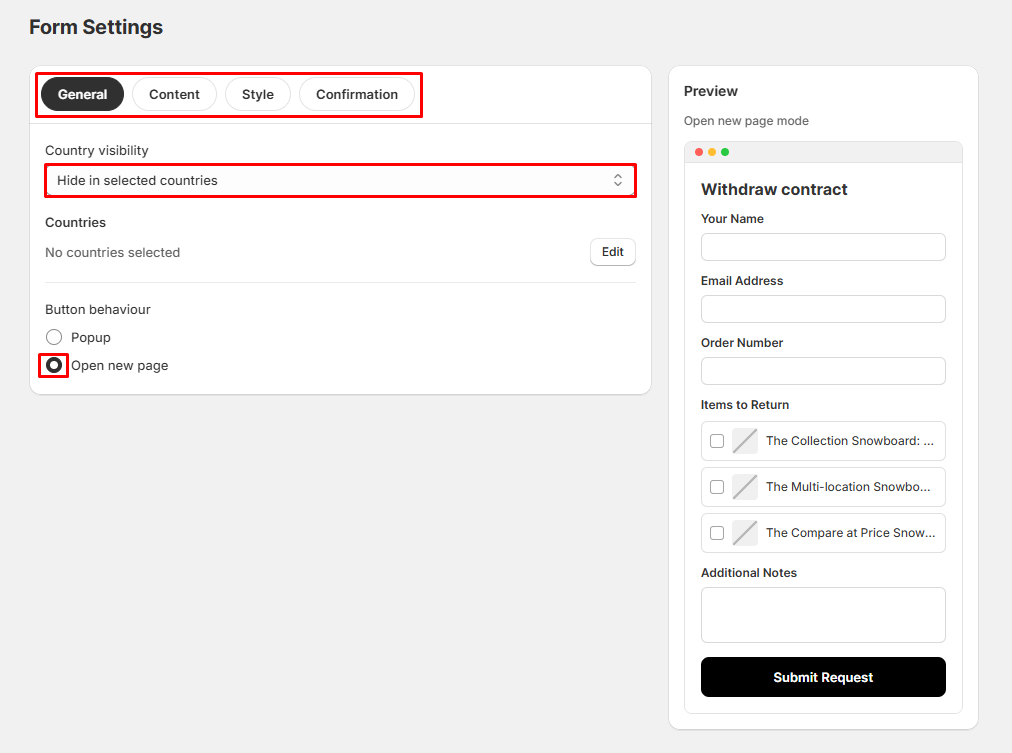
Tip: Use Popup for a quicker customer experience or Open new page if you prefer a dedicated withdrawal page.
Step 3: Customize Form Content
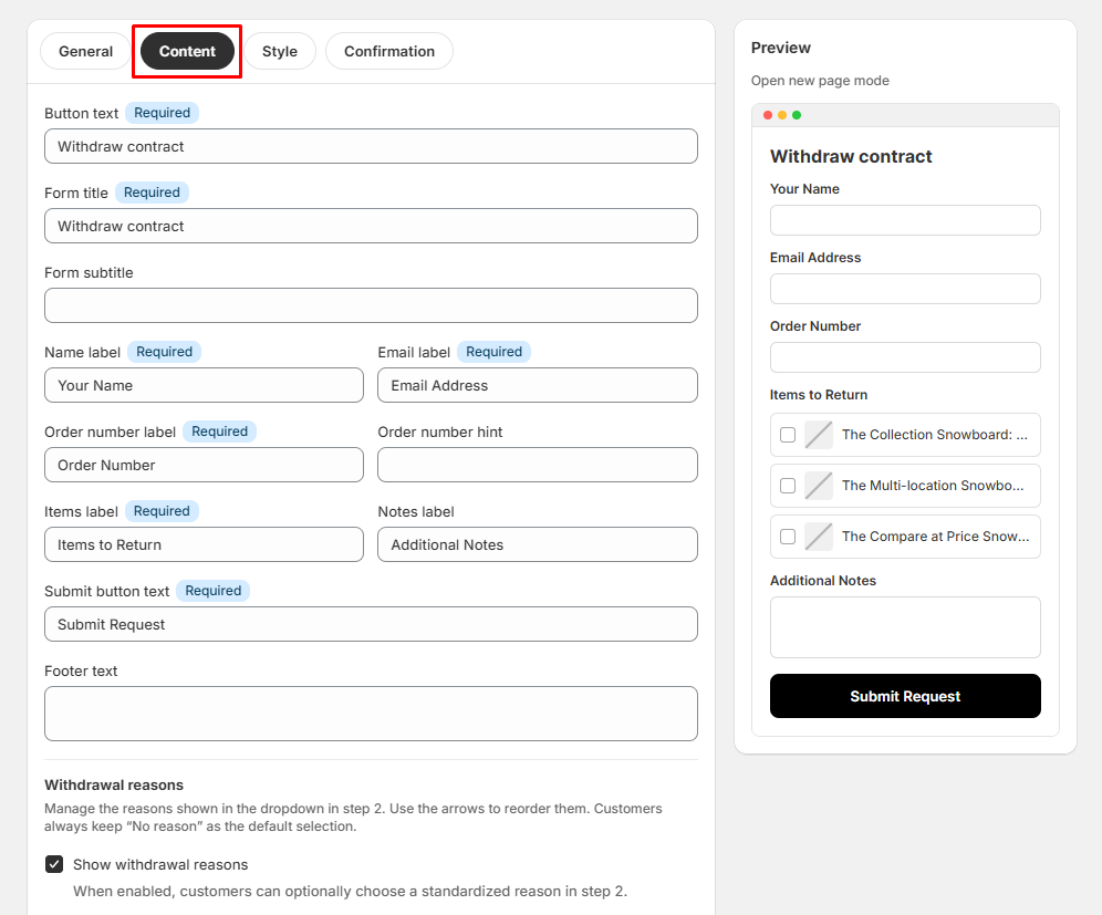
Open the Content tab to edit all text displayed on the withdrawal form.
You can customize:
- Button text
- Form title
- Form subtitle
- Name label
- Email label
- Order number label
- Order number hint
- Items label
- Notes label
- Submit button text
- Footer text
Withdrawal Reasons
Enable Show withdrawal reasons to allow customers to select a predefined reason when submitting a withdrawal request.
You can also:
- Enable or disable withdrawal reasons.
- Reorder the available reasons.
The live preview updates automatically as you make changes.
Step 4: Customize the Form Style
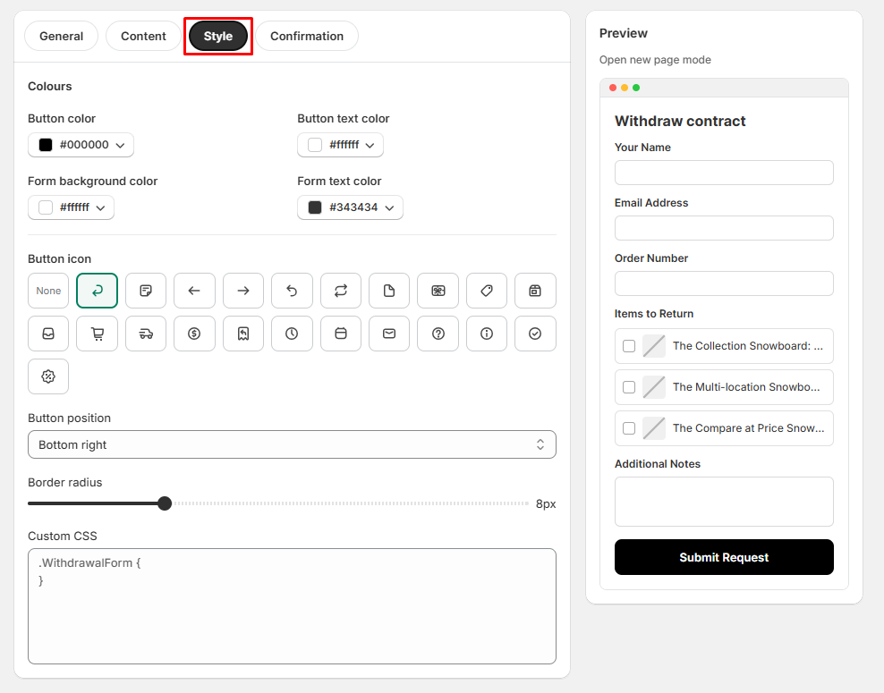
Open the Style tab to match the withdrawal form with your store branding.
Customize Colors:
- Button color
- Button text color
- Form background color
- Form text color
Select a Button Icon:
- Choose an icon to display on the withdrawal button or select None if no icon is required.
Button Position:
- Select where the withdrawal button appears on your storefront.
Border Radius:
- Use the slider to control the roundness of the form buttons.
Custom CSS (Optional)
- Advanced users can add custom CSS to further customize the appearance of the withdrawal form.
Step 5: Configure the Confirmation Message
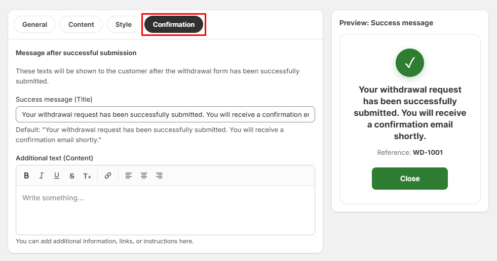
Open the Confirmation tab to customize what customers see after successfully submitting a withdrawal request.
Success Message
- Edit the title shown after a successful submission.
Additional Content
Use the rich text editor to add:
- Instructions
- Additional information
- Support contact details
- Helpful links
- Return policy information
The preview panel displays the confirmation screen exactly as customers will see it.
Step 6: Save Your Changes
After completing your customization:
- Review the live preview.
- Click Save.
- Visit your storefront to verify the withdrawal form appears and functions as expected.
Tips:
- Use country visibility to control where the form is available.
- Keep labels clear and easy to understand.
- Match the form colors with your store branding.
- Use the live preview to review changes before saving.
- Add helpful confirmation messages to improve the customer experience.
- Use Custom CSS only if you need advanced styling beyond the built-in options.